Pages

Showing posts with label Contemporary Artist. Show all posts

Monday, October 2, 2017

Building Prints

This was a project that I did with my 4th graders at the end of the year last year for something quick, fun, engaging and collaborative.

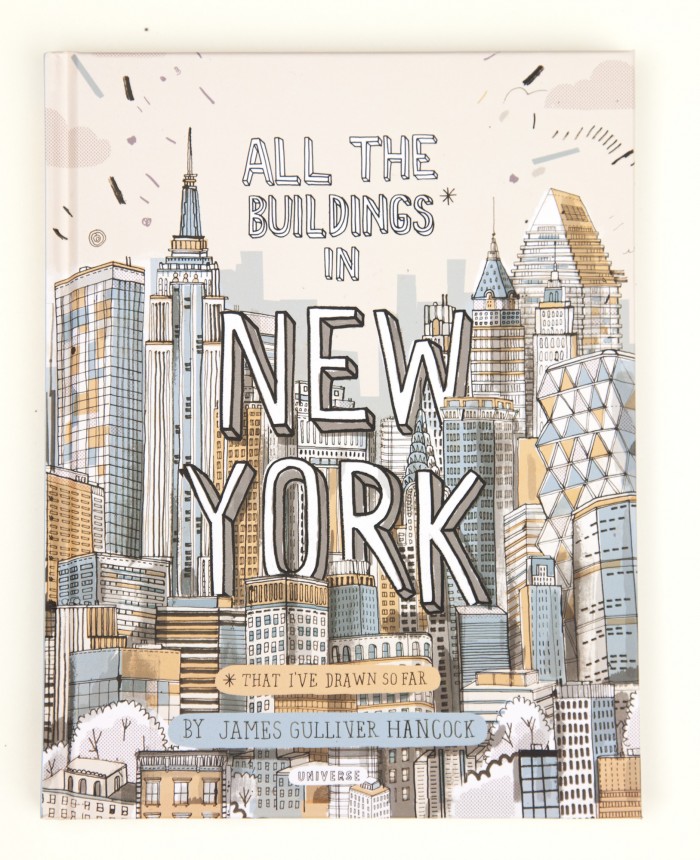
This project was inspired by contemporary illustrator James Gulliver Hancock and his book All The Buildings In New York that was lent to me by one of my Elementary Art team memebers. 

jgh_allthebuildings_book_7
Take a minute to explore his website. He is incredibly talented and does a large variety of work. I scrolled through a bit of his work with students and they loved it. I ended up buying another book of his which isn't appropriate for young students but is seriously amazing called Artists, Writers, Thinkers, Dreamers: Portraits of 50 Famous Folk & All Their Weird Stuff and I fell in love with it. You can get both books on Amazon.
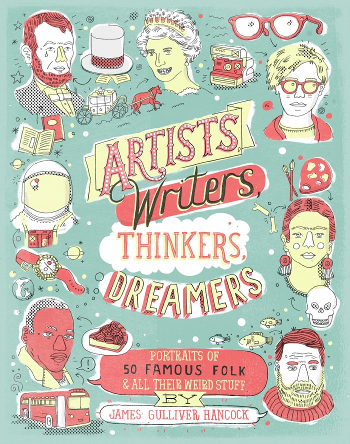
ArtistsWritersThinkers_CASE_1G.indd

So here is how the project went down, and it went fast and quick because it was their last 4 art classes of the year.
I Can illustrate a building and print it to be a part of a collaborative installation art work.
Day 1:
First we looked at crazy architecture with this video:
Then, looked at his website and listened to illustrator James Gulliver Hancock:

All the Buildings in Melbourne from James Gulliver Hancock on Vimeo.

They had to finish drawing a building that filled most of a 6X9 piece of paper, without too much detail (because it won't print), and had to remember to flip any words like a stamp. I encouraged drawing directly with pen like our inspiration but didn't require it.
IMG_1668.JPG
Day 2:
A quick demo of transferring to a printing plate that was cut the same size as their paper (6x9) and then they had the rest of the time to complete it so they could print next class. I just use the generic packs of foam printing sheets from School Specialty and cut them down to smaller sizes. We taped a hinge to keep drawings lined up when transferring. They traced once over/on the paper to get the initial lines then flipped up the paper and did it again to make it deeper with a dull pencil.
IMG_1680.JPG
Day 3:
Printing! A quick demo of printing from the plates and then they had to find a printing buddy to work with and to assist. I cut sheets of every color construction paper I had, black and white tempera paint, and brayers for students to use. They had to print until they had AT LEAST 3 good prints, but could keep printing the entire time if they wanted. 
File_000.jpeg
Day 4: 
We passed out prints, filled out the rubric and handed in the print that they wanted up in the the farewell 4th grade village and in artsonia. If they finished that, they could trade prints with friends and make mini villages. They took extra prints and mini villages with because it was the last day of art for most!


A lot of success across the board in each step so I will likely be doing some version of this again in the future!

Saturday, February 20, 2016

2nd Grade Underwater Self-Portraits (2015)

Second graders loved Robert Wyland so much that we did two projects inspired by him. Out first was Warm and Cool Waves, the second were these AWESOME underwater self-portraits inspired by thisthis AND this project via pinterest.


I Can statements: I Can draw a self-portrait with my features in the correct places. I Can draw a sea creature realistically.

Day 1: To kick off the project we looked at portrait photographs that were taken underwater and discussed what looked the same and different as above water. 

I showed them this video of Wyland painting underwater to connect back to Wyland. How freaky and awesome would it be to paint underwater!?


After all this chatting we got to work drawing the self-portraits. I did a draw along with them up on the SMART Board to help guide where to put features and how to draw the snorkel and mask.

Day 2: I checked out a large variety of sea animal books from the library and had them look through the books and choose a sea creature they wanted to draw. Before they added it to their portrait they had to practice drawing it using the books and attempt to make it look more realistic. I really pushed drawing from the images and not from their minds. This was a little difficult of a concept for them, but by the last group of 2nd graders, I finally found the right way to describe what I meant. When their practice was done I gave them their portrait to add the creature to. Nearing the end of class we came back together to talk about what good coloring looks like with crayons and how to achieve it so those that were ready to color could start.


Day 3: Refreshed our coloring discussion and then they got busy coloring. When the first few were done coloring, I showed my demo of using liquid blue watercolor to do a wash over the entire page. I really made a point to explain that any paper that was showing was going to turn blue so "bad coloring" would be really visible. Make sure they color the white of their eyes or their will possibly be tears when they turn blue....

  
These just make me so incredibly happy to look at!

Tuesday, February 9, 2016

2nd Grade Warm and Cool Waves (2015)

To hit the 2nd grade curriculum of a contemporary artist and a social artist I introduced them to Robert Wyland. They were pretty pleased to do an artist that was still alive :) Project came from here via Pinterest.


A little background on my project choice...for those of you in the Educator Effectiveness world (EE) our SLO as an Elementary Art team is one that travels with a group of students from 1st to 4th. Last year it was based on Primary/Secondary Colors, this year Warm/Cool and next year will be Complementary. Therefore, I needed to do a project about this time of year that used warm and cool colors to help reinforce!

I Can Statements: I Can tell you something about Wyland. I Can identify warm and cool colors. I can paint a sunset with warm and wave with cool colors.

Day 1: Critique O'Keeffe Leaves, Intro Wyland, artist book, Wyland inspired drawings.

Wrapped up our O'Keeffe project with a group hamburger critique (more on that later), and moved on to learning about Wyland. Because he is still alive there are some awesome resources out there... we watched a few video clips to help learn about him...


He really allows for great discussion about what inspires people to paint different things and I had some really great conversations with students about this. Wrapped up intro day with free drawing ocean artwork...

Day 2: Intro Warm and Cool Colors. Drawing and painting wave (cool colors).
Had a few slides showing the separation of Warm and Cool and the trick of associating fire and water to the two groups to help remember them. Used this Youtube video as well..

Then they started drawing and painting the wave. I had them do pencil first and trace in black oil pastel. For paint, I really wanted them to play mad-scientist mixing wise to understand that the cool colors all "like each other" so I used really watered tempera paint. I gave them teal, blue, purple, and green to share as a table and then their own mixing cup. Because the paint was so watery craftsmanship was a big problem for some 2nd graders.


Day 3: Review Warm and Cool. Painting sunset (warm colors).
We did two quick review games before they moved on to painting the warm colored sunset. In my last district we had a ton of donated paper of all different color varieties so I made 6x6 laminated squares of basically every color I had. Our first review game was me turning around really fast with a color and they had to do "Brrrrr" arms if it was cool and fan themselves off it was warm. Next I passed out the squares randomly and they had to sort themselves into Warm and Cool.

After our review they painted the sunset. We traced a circle lid with a warm colored pencil to be the sun and then worked our way from yellow to red and mixing in between to paint the sunset. They used the watered down tempera again for this in red, yellow, and orange.


REALLY love how these turned out and all the different varieties in the waves. Plus they were totally psyched to be doing so much mixing.

Sunday, January 31, 2016

THIS ARTIST DUO THOUGH....

Three things you should know about me...

#1 Paper is my favorite medium to work with
#2 All of my work is about color
#3 I excelled in 3D in college but never found the best way to pursue it in my personal work outside of college so I have a pretty deep love for it

Here is why those three things are very important...

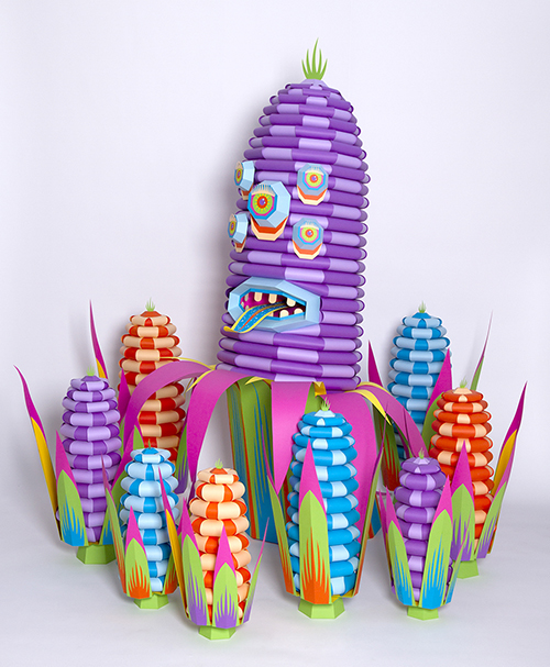
Someone posted (on the incredible) Art Teacher Facebook group a link to an installation of a French duo who create mostly paper art and I am IN LOVE. They call themselves Zim&Zou and started off in Graphic Design and moved to working with materials like paper, thread, and wood.

Do yourself a favor and spend hours exploring their website...


Most of their projects are also geared around bigger issues like genetically modified food and the food industry...


They even have some videos and images of their process so great resources to show to students.
Edible Monsters - Behind the scene from Zim and Zou on Vimeo.

Now I just have to come up with a project to connect to!

Saturday, January 2, 2016

2nd Grade Artist Books

Here is a look at the "Artist Book" I created for my second graders to use each time they are introduced to a new artist. Second grade curriculum is all focused on artists so this is a great way to track what they learned.
 When we start the year with our first artist they get the cover page and their first empty page. They fill out just the front of the page when the artist is introduced and then when we finish the project they complete the second page.


The pages are pre-3-hole punched and the books are held together with brad fasteners. Each page gets added as we go.

It seems to be just the right amount of writing for second grade. We fill out most of it together on the SMART Board and they are responsible for doing only two sentences that are entirely their own. I used to get complaints from students about having to write in Art but the longer I am teaching the less of those comments. I think because we are starting to put literacy in every subject they just go with the flow.

Thursday, May 14, 2015

Britto's Lady Liberty (Freedom) with 3rd Grade

I LOVE when I find amazing resources online to show my students about contemporary artists....and the internet is full of Romero Britto ones that were perfect for this project!


I knew I wanted to do a contemporary artist project with my 3rd graders and to work on my PPG (for those of you not in Educator Effectiveness land it's my Professional Practice Goal). My PPG is collaborating with classroom teachers, so I talked with the 3rd grade team and  I found out they were doing USA Government. After a little pinteresting I stumbled upon this Pin of Britto's "Freedom" artwork in his shop on his website....and I had a project!
Britto's Freedom
I Can Statement: I can draw and color a Statue of Liberty inspired by Romero Britto.

Day 1: Britto introduction...a little background information and then some GREAT youtube videos that all were embedded and flowed with my google presentation....

This first one is a clip from the Super Bowl halftime show featuring his work...


Then the Piece De Resistance! An animated version of his artwork done by LG...


Lastly a great little clip talking about his specific artwork we were looking at...


When all was said and done they made awesome connections to their daily lives, learned more about Pop Art, and explored many Britto works of Art and we didn't even start creating yet!

With the time left they practiced coloring different "Britto patterns/designs" on coloring sheets that I had broken up into different sections.

Day 2: Quick review of Britto and then another AWESOME animation by LG of Britto's work.


Finally time for Lady Liberty! Together we did a draw along however, I took pictures while I was drawing my example in the different steps and had this for students to look at in their spots if they wanted to do it independently. I also had it projected on the screen while I did a draw along on the board....

After we finished the draw along they started coloring, about 50/50 were done on this day so on the next work day that fell near Dr Suess, they created these Britto inspired Seuss hats! And I couldn't help but show them one more great video...


If I did this again I would probably have them work on a larger scale or with materials other than marker but I am pretty happy with the way it went..


Monday, April 13, 2015

Jim Dine "Four Hearts" with 1st & 2nd Grade

Back in February I started introducing Contemporary Artists to a few different grade levels. First and Second grade were introduced to Jim Dine. It was right around Valentine's Day when I began to introduce him which was perfect timing as he is widely known his heart art!


Last year I started recording some of my demos ahead of time and during instruction I would play the videos and narrate as students watched. I started this at the end of last year, just twice, and I was really surprised with how many more students were successful. I believe what it came down to was they were in their seats, full attention on the screen, rather than standing around a table with the ability to chat. And be distracted by their friends. And standing so close they can't keep their hands to themselves.

Anywho, while I was making my example for this project, I realized it would be the perfect occasion to use this type of instruction.

I Can Statements:
I can create a heart artwork inspired by the artist Jim Dine.
I can mix primary colors to get secondary colors.

Day 1: Short introduction to Jim Dine and talking about the kinds of things that appear in his art work and talking about Pop Art. This is all done through this PDF artist poster I put together...


Then a closer look at this painting, one of my favorites....

Jim Dine "Four Hearts", 1969
I try to use color mixing as much as possible with younger kiddos so I decided to make the hearts four different colors that they would have to mix instead of duplicating Dine's work. So they started with watching my demo video and predicting what colors I was going to get as they watched me mix. Once the video was done they drew a heart in each corner of their paper. I tried with the first class to not have them break up the paper into four sections first, but it was a little bit of a bomb so for the other classes they drew a horizontal and vertical line to break up their papers before drawing the hearts.

AND THEN THE MAGIC HAPPENED. They got primaries and white and had to mix a green, purple, orange, and choice color (in no particular heart on their paper). I love watching them mix colors....there is so much joy in making colors appear by your own hands.


Day 2: Started with looking at my artist poster of Dine again and seeing what they remembered about the artist and then watching another demo video of creating the background. They used their fingers like stamps and this time did not have to mix secondaries to create their background. I covered/filled my background like Dine's piece but they were not required to.

Day 3: A few minutes were taken to trace their hearts with sharpie for a little extra pop!

Very happy with how these turned out and I could tell how much they loved mixing their colors and using their fingers to paint!

Jefferson Elementary...


McDill Elementary...


Thursday, April 9, 2015

I'm in total awe.

I WILL be showing this to my students. What an inspirational artist with the ability to overcome something so many others struggle to live with and a gift that transcends site! The colors are so incredible. I'm in total awe. Kudos John Bramblitt.


Nothing is impossible! This blind man creates vibrant paintings just by using his sense of touch. #AllTheFeelings
Posted by The Daily Share on Wednesday, April 8, 2015

Monday, April 6, 2015

Contemporary Artist Dalek with 4th & 5th

UPDATE! E-mailed James (Dalek) the post to my blog to share with him my students work and this was his wonderful response.. the awesome perks of being inspired by artists still alive!

Thank you for your email and the link to your blog . I love the day by day break down and the fact that you used sharpies : ) the pieces look amazing . It's always cool to see how these sorts of projects come together . Their color selections and compositions are really cool !! It's really kind of you to share this with me . Please share with the kids that I'm impressed with heir final pieces and please don't hesitate if there are questions I can answer

Thank you again

James


When I saw this post over at Shine Brite Zamorano I was so inspired by contemporary artist James Marshall (aka Dalek) and the work the students did based on his art! I knew I had to do my own version with my students...


I can statement: I can use line and color like the contemporary artist Dalek in my artwork.

Day 1: Started off the project with a little background of Marshall and the transformation in his artwork from his space monkey character to his current work. Warning! Make sure you look carefully at his space monkey work before showing students....a lot of them are featuring him stabbing or in other "bad choice" situations as I share with my students.


 We also watched a great YouTube video of Dalek working on a mural in Colorado which provided a great platform of discussion about whose artwork it is if others help.


After the mural discussion, we took quite a bit of time exploring his newer artwork and came up with a very impressive list of qualities in his work. I wish I would have taken a picture of the board with their ideas! I was so impressed with the way they spoke about his art and the vocabulary they were using!

James Marshall (a.k.a. Dalek)
They all started their pieces with me with a few required lines. I had them do one vertical, one horizontal, and one diagonal to make sure they had a good space to start with. Before I sent them off on their own,  I demoed a few of the more intricate drawings they could do but were not required to do. They spent the rest of the time drawing. Any circles were created by tracing lids and all lines with rulers.

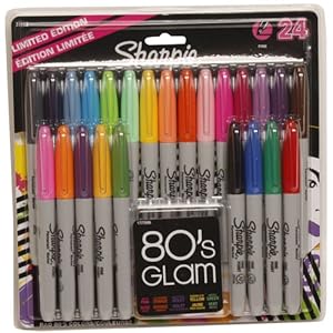
Day 2: Now let me tell you how wonderful my PTO is! Each year I get some funds to use on whatever I want for my classroom and this year I decided to buy large packs of multicolored sharpies that were CRAZY on sale at staples. Like $9 on sale. I knew they needed to be used on this project!


When students were ready to color on the second day I made a huge deal out of these sharpies. We talked about how only 4th-6th graders were going to be allowed to use them and the best way to color with them to keep the tips sharp. I was so pleased with how well students took care of the markers! They might even last to do this project again next year!


I think sharpies were a great choice in material because looking at his work the solidness of the colors really added such a striking visual quality. And it did to their work too, even when their design was lacking.  

LOOK AT THIS COLOR (and design)!

Days 3-5: Work days! Each day we reviewed how he used color in his work as reminders about how to use it in theirs and not just get excited about all the colors they had to choose from. Even though the final artworks were only 9x9 it took them quite awhile to finish but I was more than okay with that because I knew it meant a higher quality of work!

Jefferson Elementary...


McDill Elementary...