Pages

Saturday, June 28, 2014

Portrait Monoprints and Zentangles? with 5th Grade


I really love mono-prints. They are probably my favorite thing to do in the realm of printing so I ended up doing portrait mono-prints with my 5th graders as part of my all school portrait theme. Glad I went with 5th grade because the quality of some of the prints turned out quite beautiful and I don't think that would of happened in lower grades!


After stumbling upon so many Pinterest projects and hearing about Zentangles from my colleagues, I had to give it a try once this year. I decided to incorporate it into this project as the boarder of the mounted print. Turns out, didn't work so hot on this project! I think it was too simple of a space and not the right kind of space to do it in. (I'm still learning about Zentangles too!) Still really love the printing part of this project, so did the students, and I will think of something different for the background/boarder for next year.

I CAN statements for the Zentangle portion:
WE CAN think of and create examples of as many Zentangle designs as possible
I CAN create a boarder for my mono-print portrait using Zentagles

I CAN statement for prints:
I CAN create a self-portrait mono-print using warm or cool colors

Day 1: Started by showing them what our final product would look like and then told them we were going to focus on the Zentangle boarder portion of it first and do the prints next time. I gave them some background knowledge of Zentangles and how they started, as well as the popularity of them. I also showed them a few examples of artwork created with Zentangles. We talked about the qualities in the lines and different characteristics of the designs and I gave them a stack of post-its and ultra-fine tip sharpie and let them loose to think of as many designs as they could for a foundation to start the project with. As they completed them they stuck them to a cabinet in the classroom to serve as our "bank" of designs for reference when starting the boarders.


After about 15 minutes they were allowed to start on the project or continue with post-its. I encouraged them not to use a ruler for measuring the boarder to keep designs looking more natural and explained that when they attached the print it would square off the designs. This REALLY stressed out some kiddos but we worked through it and/or they ultimately used a ruler.While they were working, we took a picture of each student to use for the mono-prints. Before the next class we printed the pictures of the kids in black and white full page to use under the printing plastic as the guide for prints.

Day 2: I had the word mono-print written on the board and we dissected the word and using the background knowledge of looking at my example, I had them figure out how it was created and what a mono-print was. After a good discussion we watched my demo. Now this is absolutely my favorite thing I did for this project... The day the first class was going to print, I had my assistant take a video of me, before school, using my iPad, creating the print without either of us talking. THEN when it came time to demo we watched the video as a class and while watching I explained what I was doing and went through it two times because I did a warm and cool color print. This went AWESOME. I think this worked SO WELL because I do not have a great spot to demo things so usually people can't see or they don't pay attention and talk... I will for sure be using this concept of recording my demos again in the future.

When it was time to print, they printed in small groups with me while others worked on their boarders and there was almost zero questions about the process. They slid their picture under a plastic sheet and painted over it with tempera paint (not watered down) quickly without washing the brushes in between colors (i.e. why warm and cool color sets were used). They did two prints so they could chose their strongest for their final product.

Day 3: Small review on mono-prints, re-watched demo for those who had to print this day, and then finished up printing. Almost all classes finished in 1 or 2 days. When prints were dry and boarder complete, they used a glue stick to attach the print they liked better to the boarder paper.

Pretty amazed how much some of these look just like them!


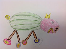
For one of my classes we were working on this right up to the last days of school...the last day of Art got a little silly and a student used their extra print and a silly project they did with a sub to make this ridiculously awesome artwork. LOVE.


I'm curious, how do you use Zentangles? Was I even in the right ball park?


Friday, June 20, 2014

Food Extension!

These are just too silly not to share! After my 4th graders finished up their Surrealism Food Faces and still had time left in class, I gave them a challenge to create a scene out of only food. My go-to is a dinosaur in a desert but these guys totally rocked it....


Thursday, June 19, 2014

Surrealism and Food Faces with 4th Grade

 When I started my school wide portrait theme I wanted to keep things interesting. Didn't just want to do classic portraits, this project that I stumbled on from Pinterest via this post, was the perfect fit in accomplishing that!


I did change a few things about the lesson. I wanted a little art history focus so I talked about Surrealism including Magritte and Dali and then our inspiration Giuseppe Archimboldo.


Awesome right?!? During my research I read that he inspired many surrealism artists even though this guy was working in the 1500s. Just do a google image/wikipedia search, really incredible stuff! I am also trying to incorporate a little more writing after being inspired to do so at the NAEA conference so I had students write 3 "Dollar" words in response to a surrealism painting. "Dollar" words being words that are worth something, so...descriptive, emotional, phrases that come to mind, just not words like cool and neat. BLEH.


I Can for this project: I CAN create a surrealism portrait using only food.

Day 1: Started off with the PowerPoint right away when they came in. The first image was a Magritte and under the image it said write 3 "Dollar" Words, this was the first time students had done the writing reactions for me so I had to explain what I meant by that. I had them share with each other and then share with me what their partner said. Some answers were silly (obviously, its surrealism!) but others really thought about what they were looking at. Then I shared with them what Surrealism was and we explored more works by Magritte and Dali. I had them raise their hands, and they didn't have to share, just as a visual for me, when they saw what was "wrong" with the image we were looking at, i.e. what made it surrealism. I really put emphases on looking at the titles and using clues from the title (HELLO COMMON CORE!) to get more information about the painting. Finally we moved into our inspiration for the project Mr Giuseppe Archimboldo. They loved this guy.


So COOL! Art history geek in me FREAKING OUT. We did a brainstorming game on a worksheet that we eventually sketched out our project on. I gave them two minutes to write as many foods as they possibly could so they had a word/idea bank while sketching. Then I showed them my example and gave a view pointers/reminders/guidlines. The original lesson I found said only healthy foods but the junk food lover in me didn't want to limit and plus it wasn't a lesson on nutrition! So there! (Collaboration idea for next time though!) Also we talked about how things did not need to be proportional or realistic in size to the other foods being used, that really opened up a lot of opportunities. Ended the day with a basic exit slip asking them if they remembered they type of artwork we were looking at this class. Answer: SURREALISM!

Day 2: Reviewed Surrealism. Started final works. Colored pencil and marker outlining. My cooperating teacher, when I student taught, was big into outlining things in marker and I fell in love with the process. LOVE the way it makes things pop! They could work either coloring then outlining or outlining then coloring. JUST NOT COLORING IN MARKERS. You wouldn't believe how many messed up on that. I wrote it on the white board and made them say it all out loud, they thought it was pretty funny but they all remembered after that! When the face was finished they added foods to the background.

Day 3: Most needed another workday so I used the extension from the original found lesson for students to do after they finished. More on that later ;)

Check them out! I LOVED this project. Some even ended up doing a fully body!


All breakfast! 


Monday, June 16, 2014

Abstract Faces with 3rd Grade

My trip to the National Art Education Association convention last spring really taught me a lot of things in terms of pedagogy but I also learned some awesome new lessons. One that I could not possibly wait to try with my kiddos was presented by Lisa Casey called Picasso Portraits. Her tag line for the presentation was "Avoiding the split profile to create abstract art that makes kids think". One of her focuses was getting away from the Picasso Cubism portraits of just using exaggeration and misplacement and really taking it to the next level of abstraction. I was a volunteer that went up to try to project and fell in love with it immediately! This project ended up being a perfect fit for my 3rd graders with the portrait theme for K-6.


I Can statement for this project: I Can turn an abstract drawing into a face.

Day 1: I begin by telling students that the start of our next project is going to be a game. Each person will start with a piece of paper and when I say "start", with a sharpie, you start drawing a line and when I say "stop" you stop and pass it. When I say "find a point" you find either the starting or end point of the previous line and the process continues (ONE continuous line is formed). The final instruction is that lines should be open and spread out, not close together and scribbly. I draw something like this to explain....


Once we pass a few times and I see how full papers are I have them stop and put caps on sharpies and talk we about Abstract Art. I decided not to get into Picasso and Cubism and just talk about abstract. I show examples of paintings, drawings, sculpture and how we usually don't see images in abstract art but sometimes we do. My favorite example is Kandinsky. I always see things in his works that i'm sure are not with his intentions. Finally I reveal what our abstract works are going to turn into and show them my example. FACES! They either get immediately excited or stressed and start searching. Before they can start drawing, we go over how to use the shapes for features. I draw this up on the board. 


The rest of the time is spent finding their faces and penciling in the features and tracing in sharpie after they have been okayed. A few students did struggle but it was great to see their peers helping them naturally on this! Woohoo! Leadership!

Day 2: Refresher on abstract! Then we talk about painting and planning. I had them all use a skin color and our reasoning on this is so that there isn't a disconnect about what we are looking at. We want it to be clear that its a face. Then I have them label lightly in pencil what color they will be painting each section. This really makes them put thought into having things "make sense" and keeps them from rushing into painting. They are allowed to paint over lines especially if in a skin section as long as they can still see the lines. Rest of the time is spent painting!

Day 3: If done painting, they trace all of their lines and details in black sharpie, cut it out, and glue to a color construction paper that compliments their paint choices. I open the construction paper cabinet and we experiment with what colors looks best with their paintings. Those who are still painting do as much sharpie work as they can and quickly finish the next class while others start on a new project.  

I was SO impressed with the work my 3rd graders did on these!
Check them out. Don't laugh too hard ;)


More posts from/about my adventures at NAEA convention here!
http://theartsyfartsyartroom.blogspot.com/2014/03/naea-adventures.html
http://theartsyfartsyartroom.blogspot.com/2014/04/naea-adventures-part-2.html
http://theartsyfartsyartroom.blogspot.com/2014/04/naea-top-10.html
http://theartsyfartsyartroom.blogspot.com/2014/04/naea-make-takes-and-my-virtual-fashion.html
http://theartsyfartsyartroom.blogspot.com/2014/04/we-are-famous.html